Role:
Product Designer
Deliverables:
UX Analysis
Visual Design
Prototype
Duration:
8 Weeks
01. Overview
PayzFast is a digital lending platform that provides lending services to users on real time basis without a collateral and with flexible repayment terms. In addition to quick loan, users can access other financial services such as money transfer, bill payment, airtime purchase etc.
02. Why Redesign?
The existing mobile app had a poorly designed interface which hampered functionality. Because of this, users are unable to perform simple task to achieve their goals thus, limiting the app functionality to it's maximum potential. Also, Navigating through the app was frustrating for users as a result of the poor hierarchy and information architecture. All of this resulted in lesser reliabilty and usage of the mobile app giving rise to the need for a redesign. The actual focus of the project was to redesign the entire app interface and optimize for better user experience. Major challenges faced by users were;
- User find the flow and navigation of the app confusing.
- General UI of the app looks out-dated and archaic.
- Improving on the functionality was a major drive for the redesign.
04. The Goals
a. User Goal
The goal of redesigning the app was to create a more unique and aesthethic interface that would provide users with smooth experience while optimizing for functionality and focusing on the key feature. Key features of the app are:
- Loan Access: Users can apply online for a business loan without going to a physical office and passing through several processes to get their loan application approved. With Payzfast app, they can make a non-binding credit request in less than 10 minutes and get a credit decision within 48 hours.
- Bill Payment: Users can pay bills, purchase airtime/data, & send money online conveniently and reliably with several payment option made available to them. Users can generate biller ranging from your electricity to water bill etc.
- Become an Agent: Users can choose to also make extra money through commission by signing up as a PayzFast agent and get verified. They also get their POS delivered to their location.
- Live Customer Support: To increase overall User experience by providing users with access to real-time conversations with support agents.
b. Business Goal
The goal of the business is to improve their products so as to gain more market share, provide better services to their customers, and increase revenue.
05. Understanding The Problem
The first step towards providing a solution was understanding the problem, the users needs, and the business need. Brainstorming sessions were held with the clients and other stakeholders to hear their perspective on the project i.e understanding the business needs and technical requirement and to narrow down the scope of the entire project.
06. Research
a. Discovery
To gain better insight into the users pain point and better understand what problem they encounter while using the app, I recruited some participants to carry out some usability task (using the think aloud protocol) on the existing app while I observed their interaction with the interface.
b. Heuristic Analysis
I then proceeded to carry out a heuristics analysis to identify common usability issues and how they can be resolved to improve the users experience and satisfaction. A heuristic analysis is a procedure used to identify a product’s common usability issues by judging and interface compliance with recognized usability principles. For this project, I adopted the Nielsen's 10 Usability Heuristics principle.
c. Key Findings and Insights
Base on the discovery to undercover key painpoint and the heuristics analysis carried out, Major insights derived were:
- The existing app doesn’t communicate clearly the system state.
- No detailed information is provided on transaction history.
- Users are required to enter their details everytime they needed to perform a transaction.
- Inconsistency in design element of existing app.
- Information on why user’s loan request is declied is not provided.
- Visual design is not appealing.
- No notification system to pass relevant information to users.
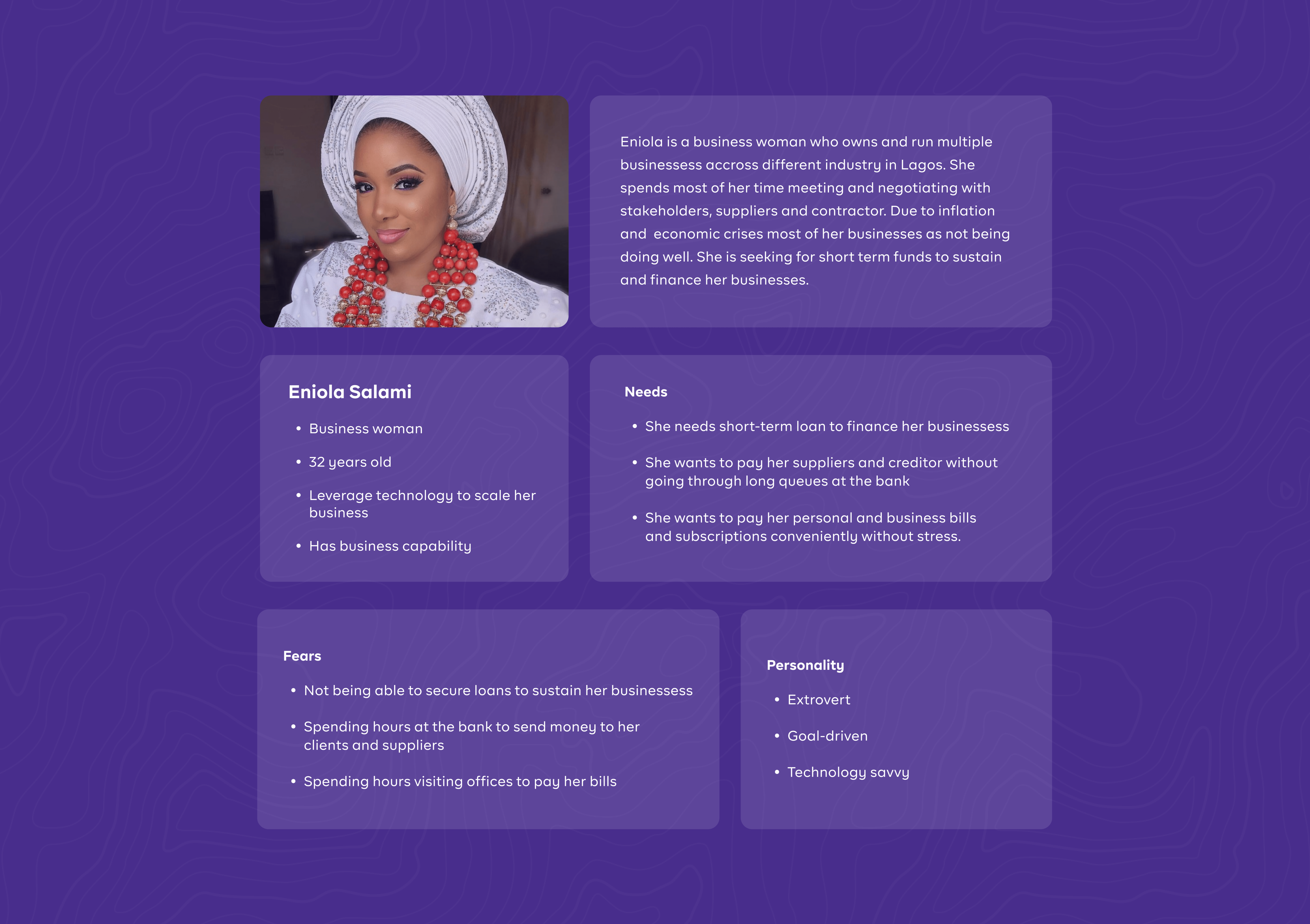
d. User Persona
Next, I created a user persona to represent the target users, gain a perspective similar to theirs and identify with the user I am designing for.
e. User Story
Base on the user persona, I came up with some scenarios to describes goal that the user wants to accomplish by performing specific actions. The purpose of a user story is to articulate how a feature will deliver a particular value to the user.
- As a user, I want to be able to input and verify my details so that I can access quick loan.
- As a user, I want to conveniently pay my bills and subscription so that my service does not get suspended.
- As a user, I want to purchase airtime and data so I can make calls and access the internet.
- As a user, I want to send money to family & friends so they can take care of their needs/bills
- As a user, I want to apply and get verified as an agent so that I can earn commission.
- As a user, I want to be able to view my transaction history to ensure my account is balanced and error free.
- As a user, I want to be able to request for loans so that I can cater for my urgent needs
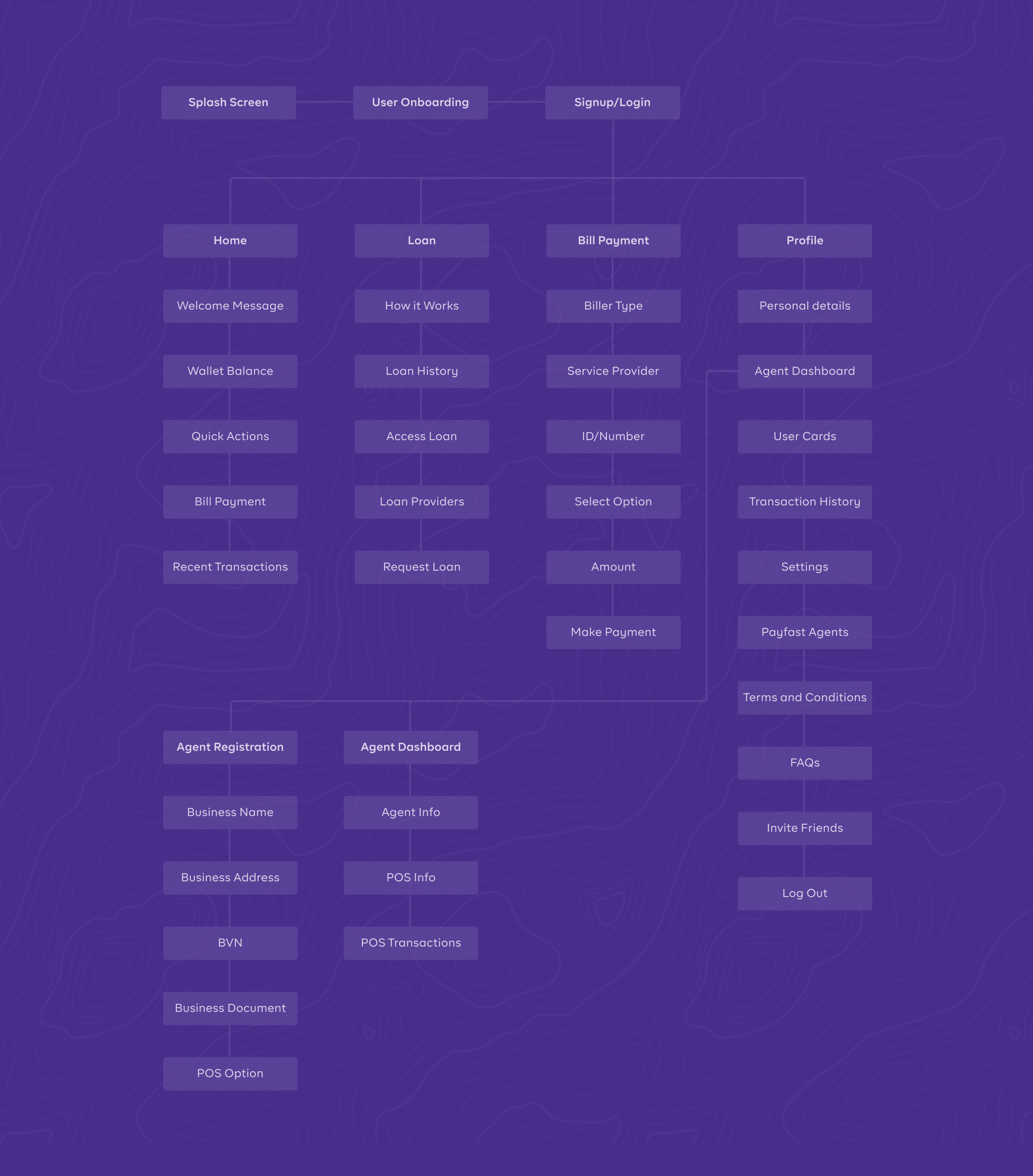
f. Information Architecture
One major findings from my research was that the existing app navigation was complex and confusing due to the hidden menu and poor hierarchy. Thus, there was need to restructure the app entire layout and redefine it’s navigation. The new information architecture for the app is illustrated below.
06. Design & Prototype
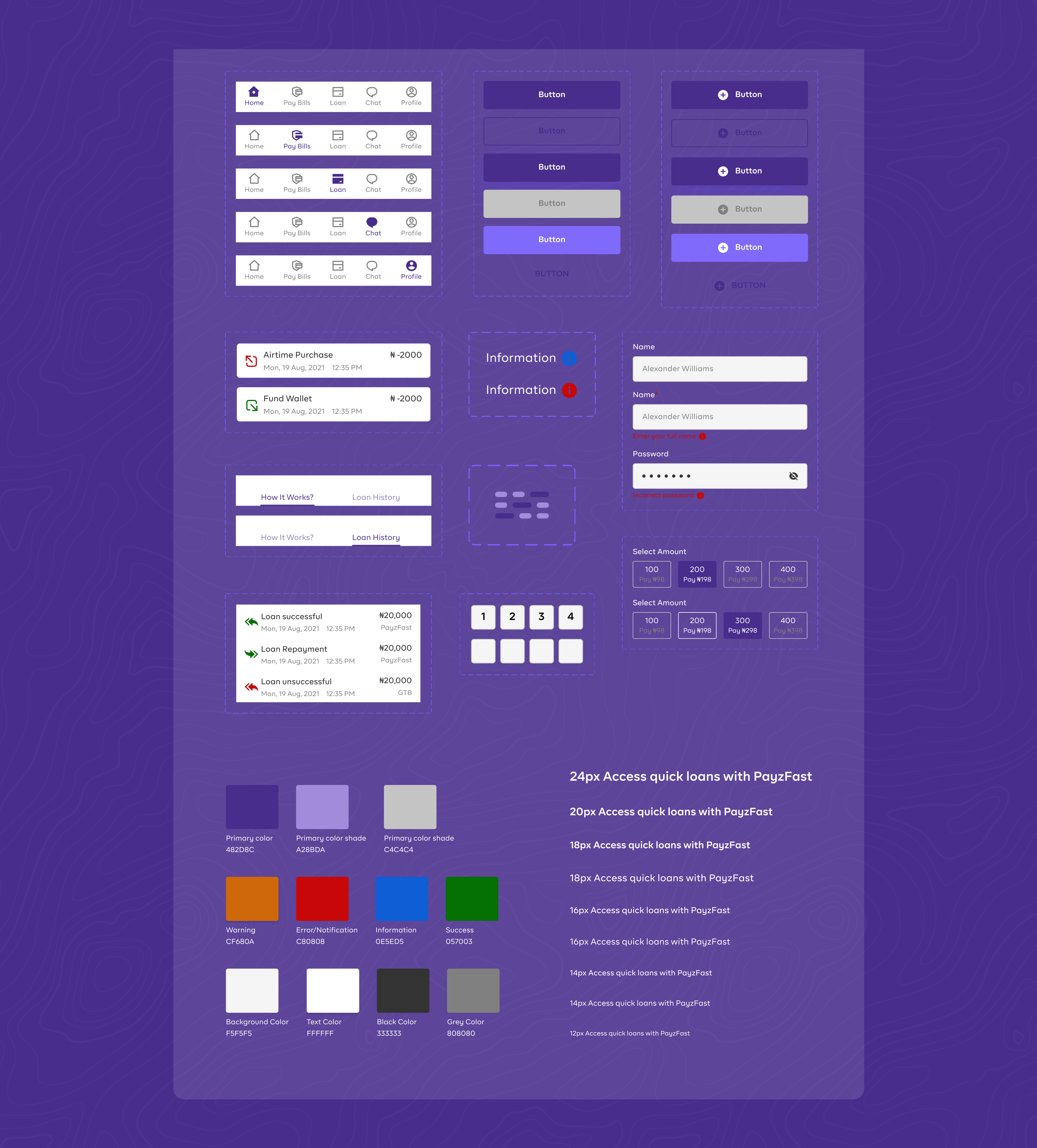
a. UI Style Guide & Components
To begin the design phase, I started of with creating a unified UI style guides which is essential for product and brand consistency. The UI Style guide consist of typography & fonts, layouts & spacing, color palettes, buttons, etc. While the component library consist of reusable assets and elements.
b. Solutions Based on Key Findings
I designed some sketches to communicate to the client what the final design would look like. Sketching allowed me iterate on multiple ideas and concept before settling for one. The high fidelity design of the app was centered on key finding from the research keeping in mind that the aim was to create a visually appealling design and improve the overall user experience.
- Note: Swipe the arrow to view and switch between previous design and redesign.
- Note: Not all designed screens and flows are presented
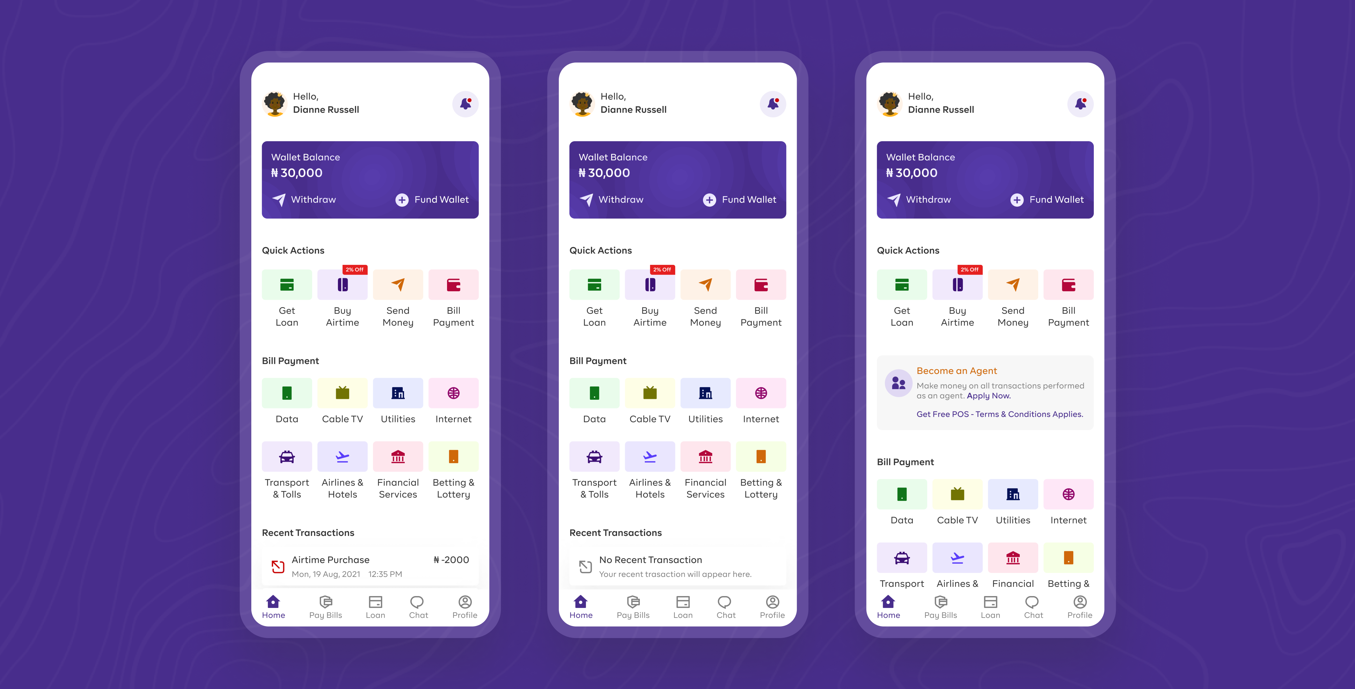
i. Home Screen
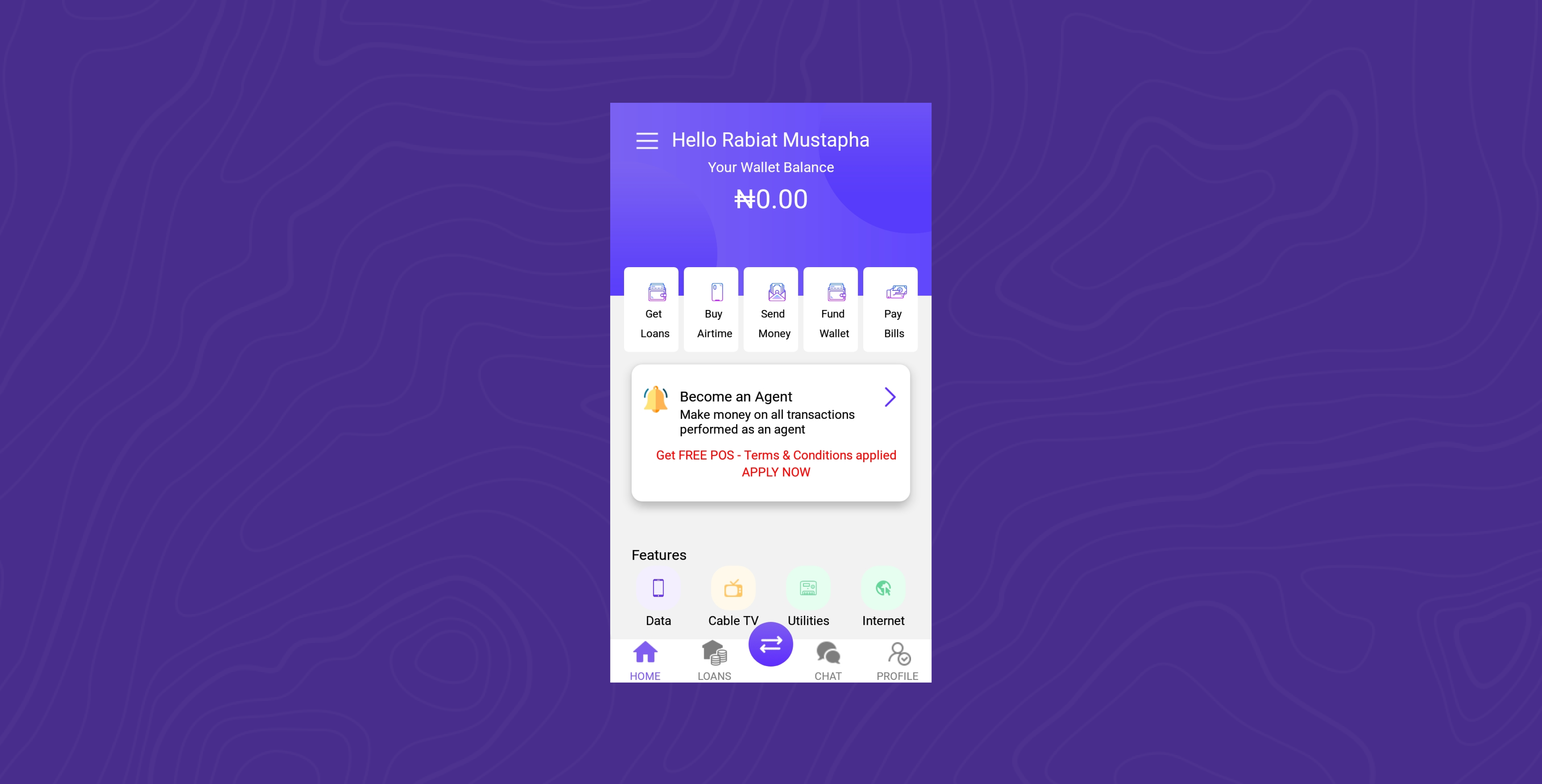
Unlike the previous design, I added a notification feature to provide users timely messages and relevant information like rewards and special offers. Recent transaction feature was also added to give users a glimpse of their recent activity. Users can perform quick transaction from the homescreen thus reducing the click rate and time taken for users to reach their goal. I redesigned the home screen to give a simple and vibrant feel.
ii. Authentication (Sign up & Login)
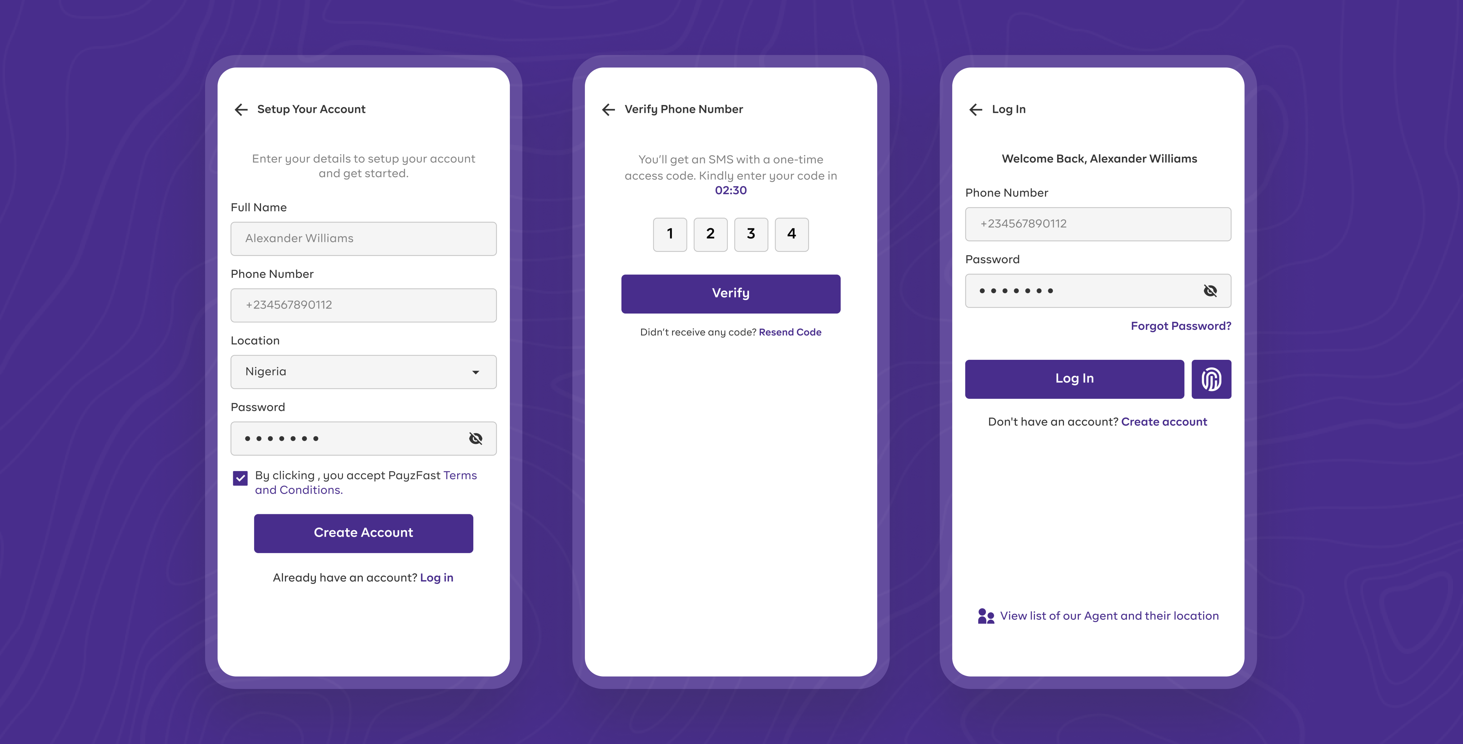
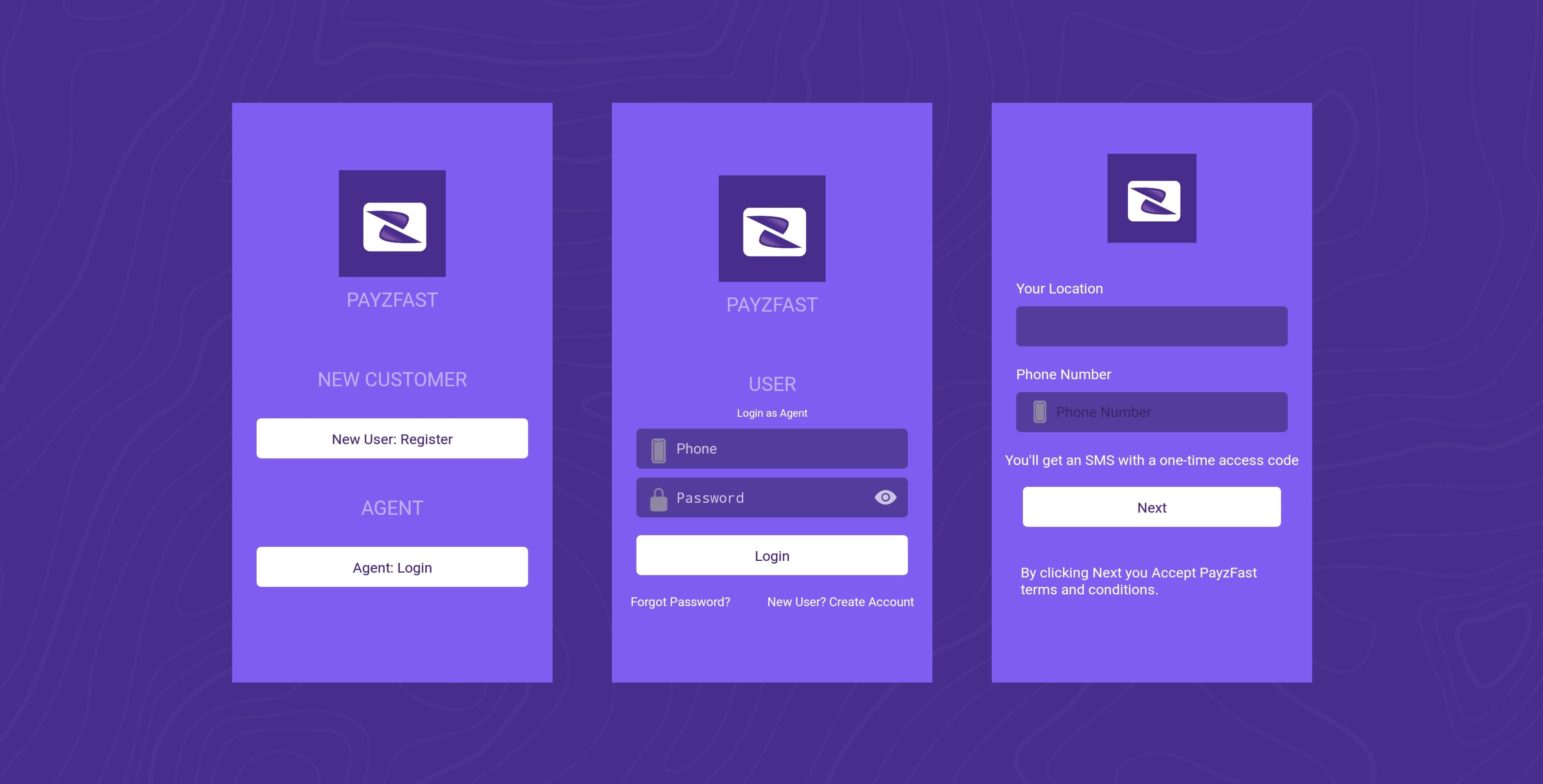
The authentication screen were designed for better contrast and to improve hierarchy of information. A single login is provided for both users and agent. The entire verification process was made easier for users by adding a Biometric login feature for better security and improved user experience (convienience and time).
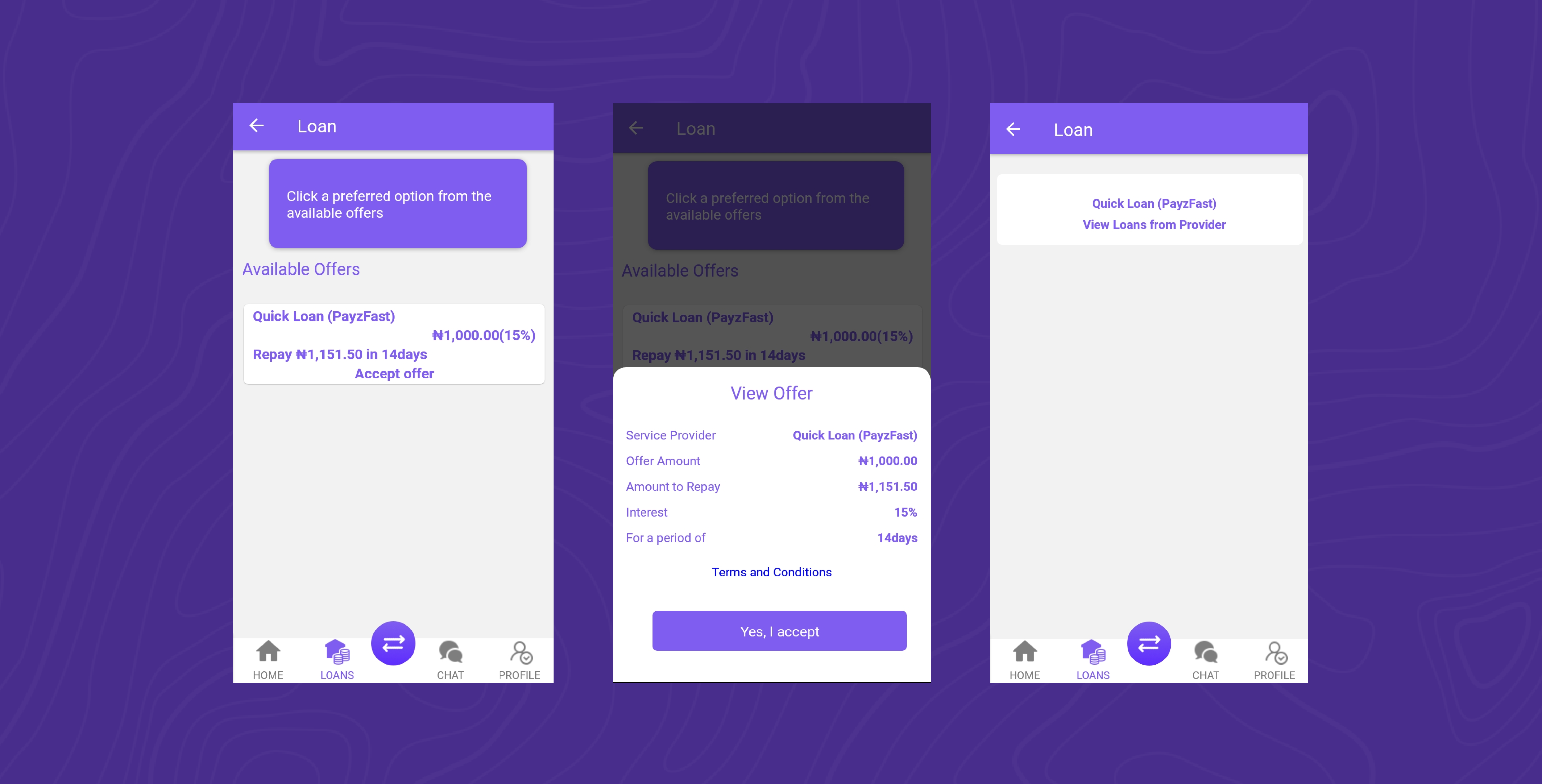
iii. Loan Request
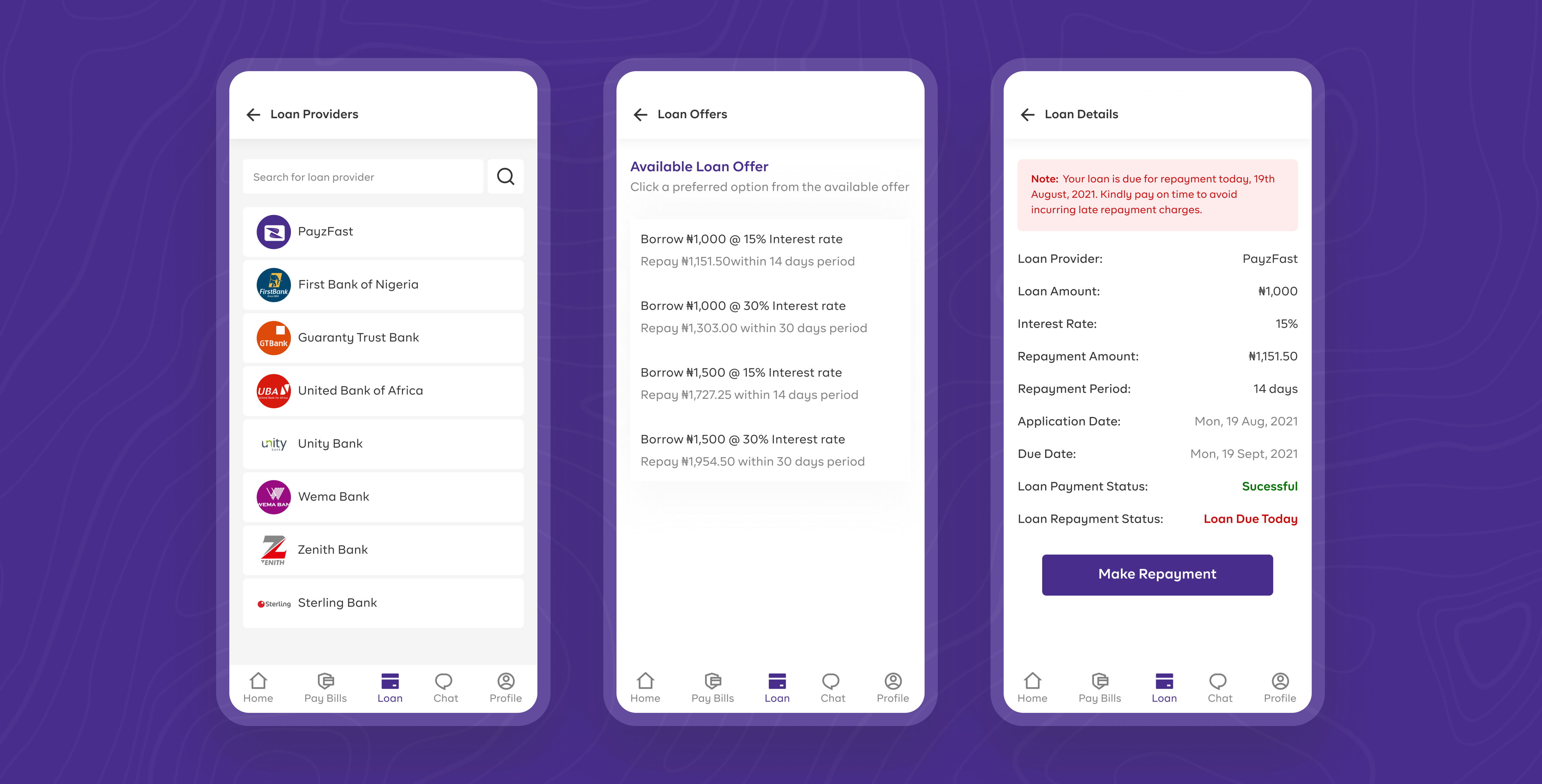
Information on the loan request flow is constructed for better hierarchy so that users can easily identify most relevant information from a bunch of information. A list of loan provider and available loan offer were added together with detailed information on interest rate, repayment period and repayment amount amount. Repayment notification is sent to users to avert extra charges that applies to late repayment.
iv. Send Money
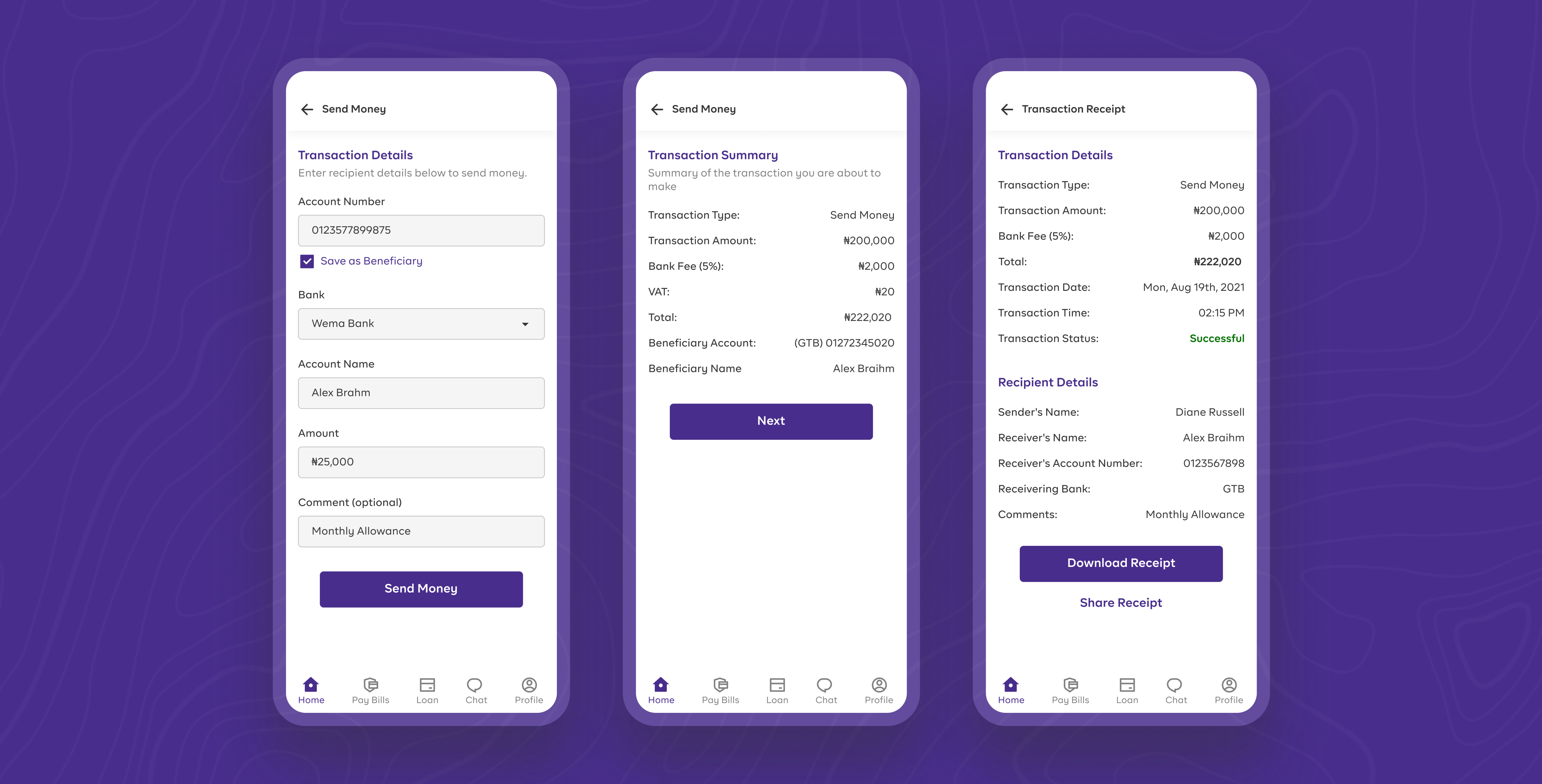
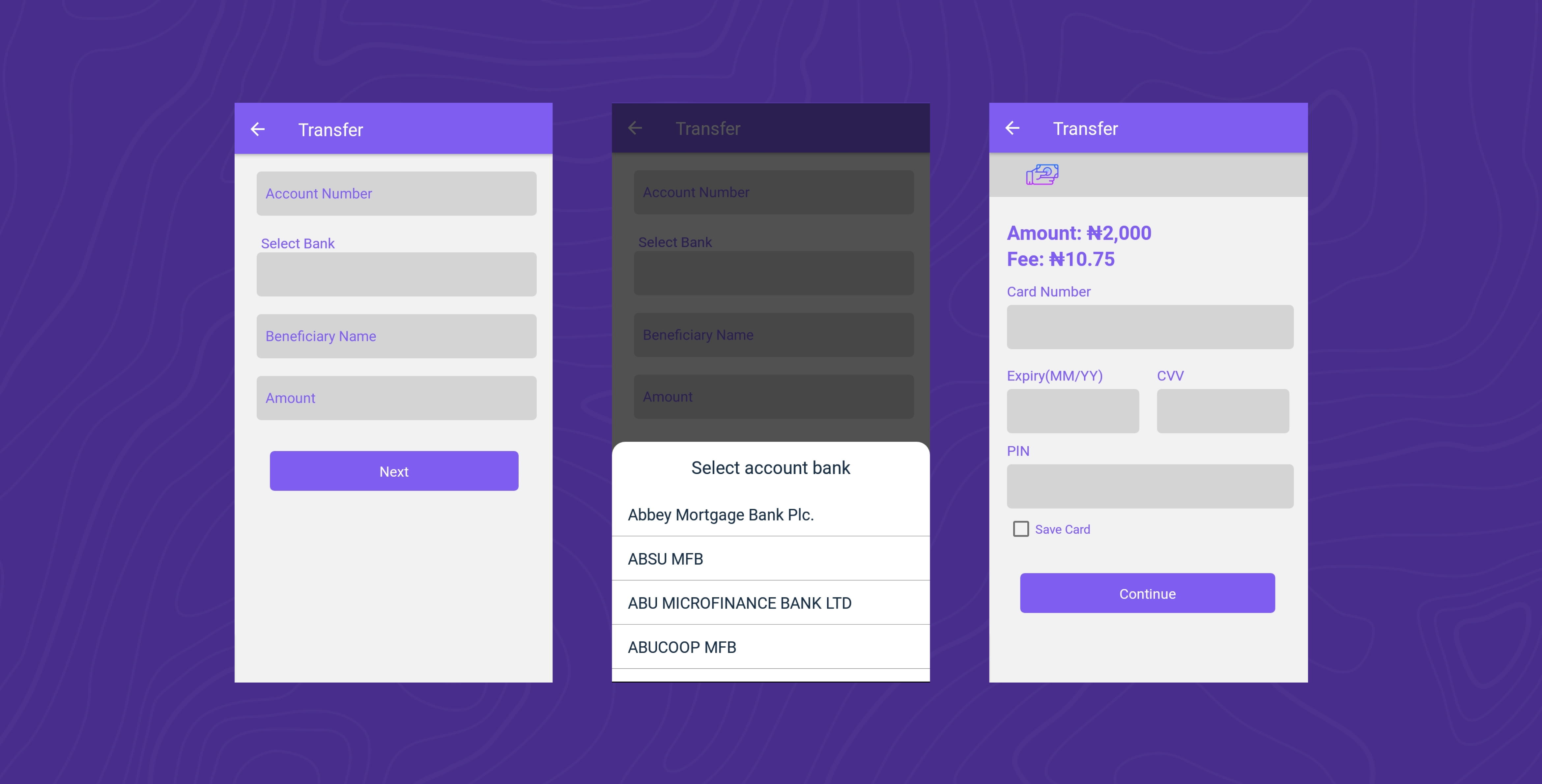
To reduce complexity and time spent on entering account details of recipient, users can save information of their transaction to beneficiary list and can retrieve this details in one click for consequent transaction. User can as well view and confirm their transaction summary to reduce error rates, and share or dowload transaction receipts for reference purposes.
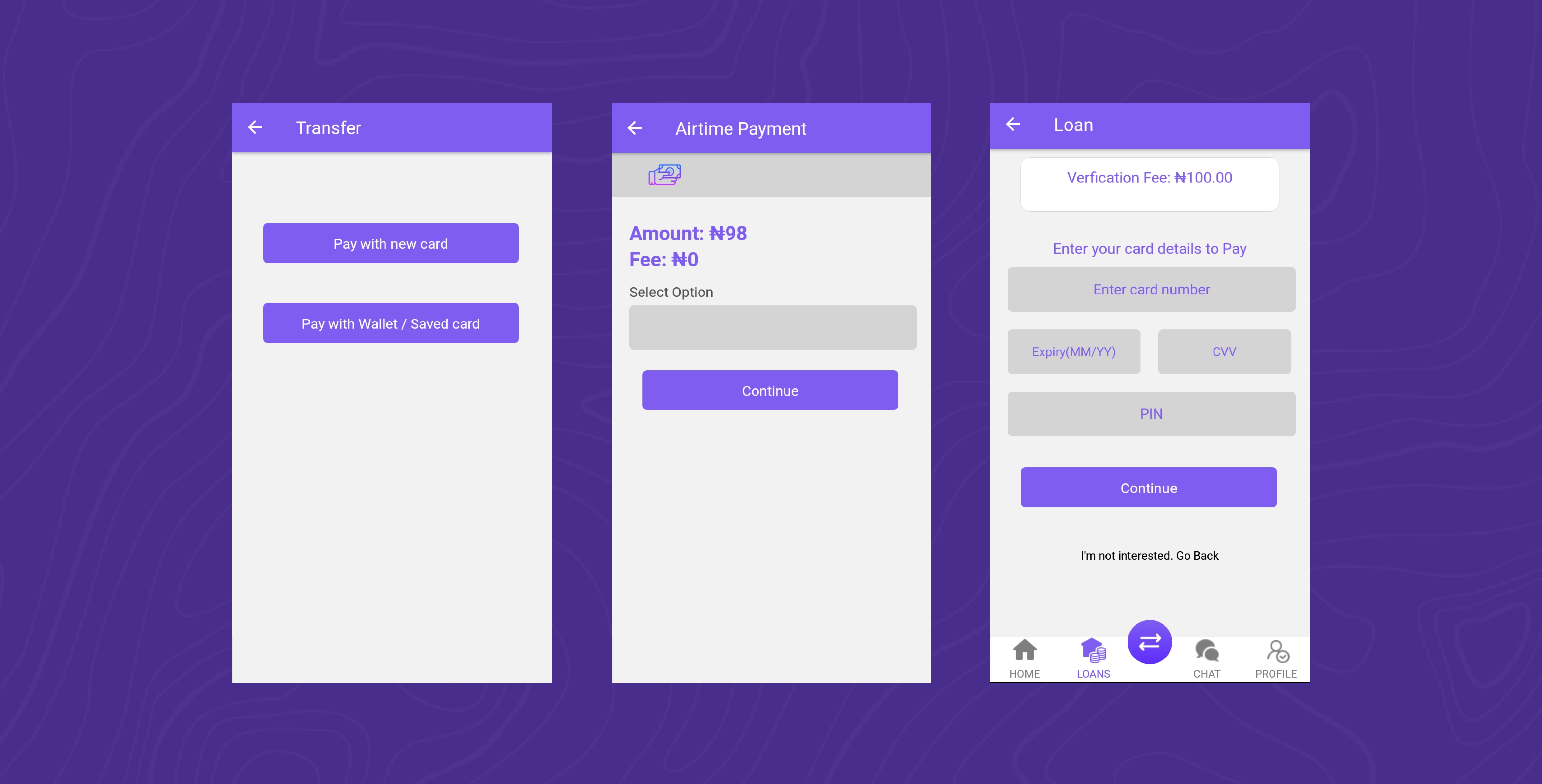
v. Payment Option
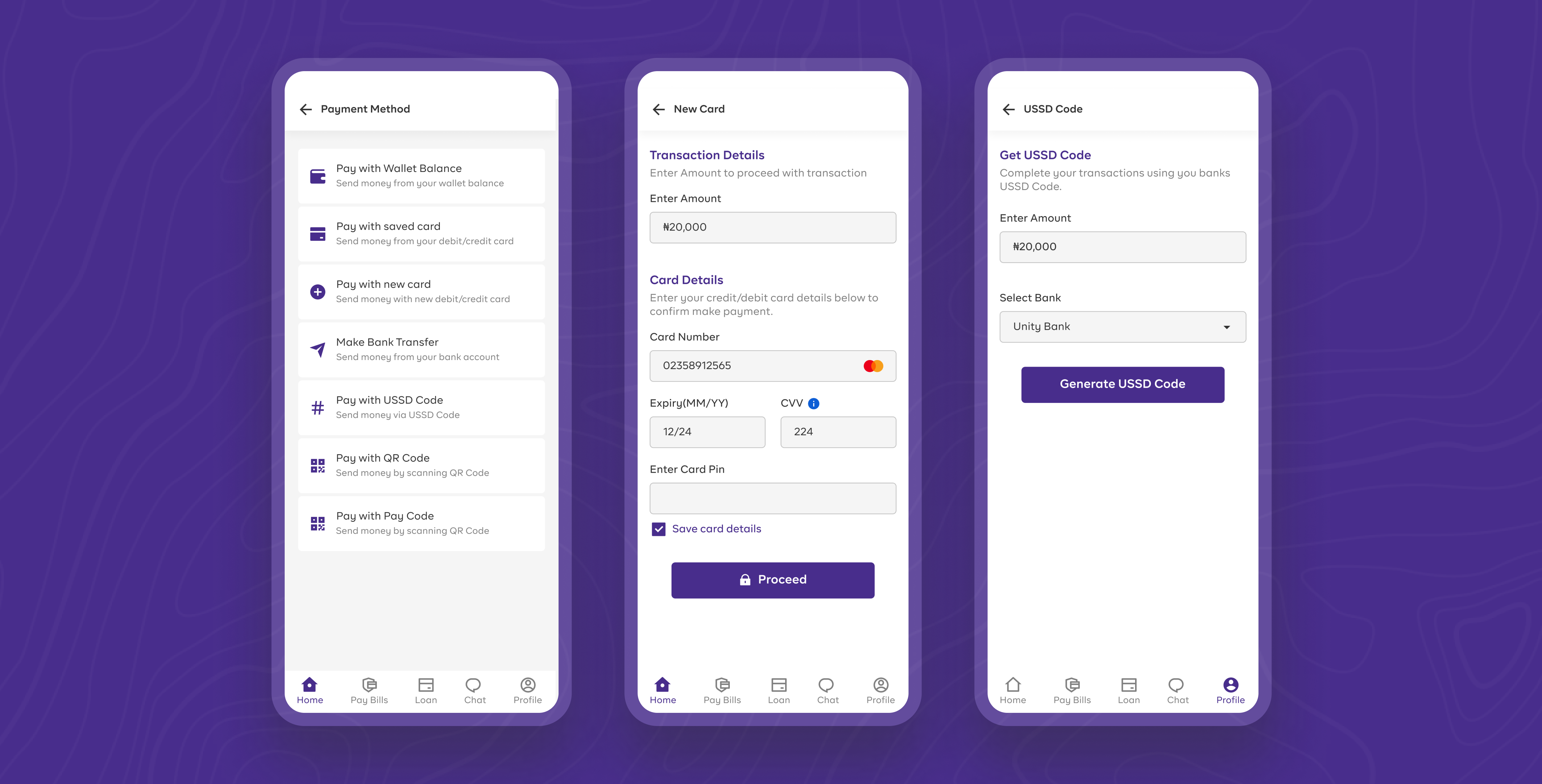
More payment option is added to give users freedom of selecting their preferred payment option. the interface is also designed for better visuals and hierarchy to gain users trust and optimize for better user experience.
vi. Agent Registration & Dashboard
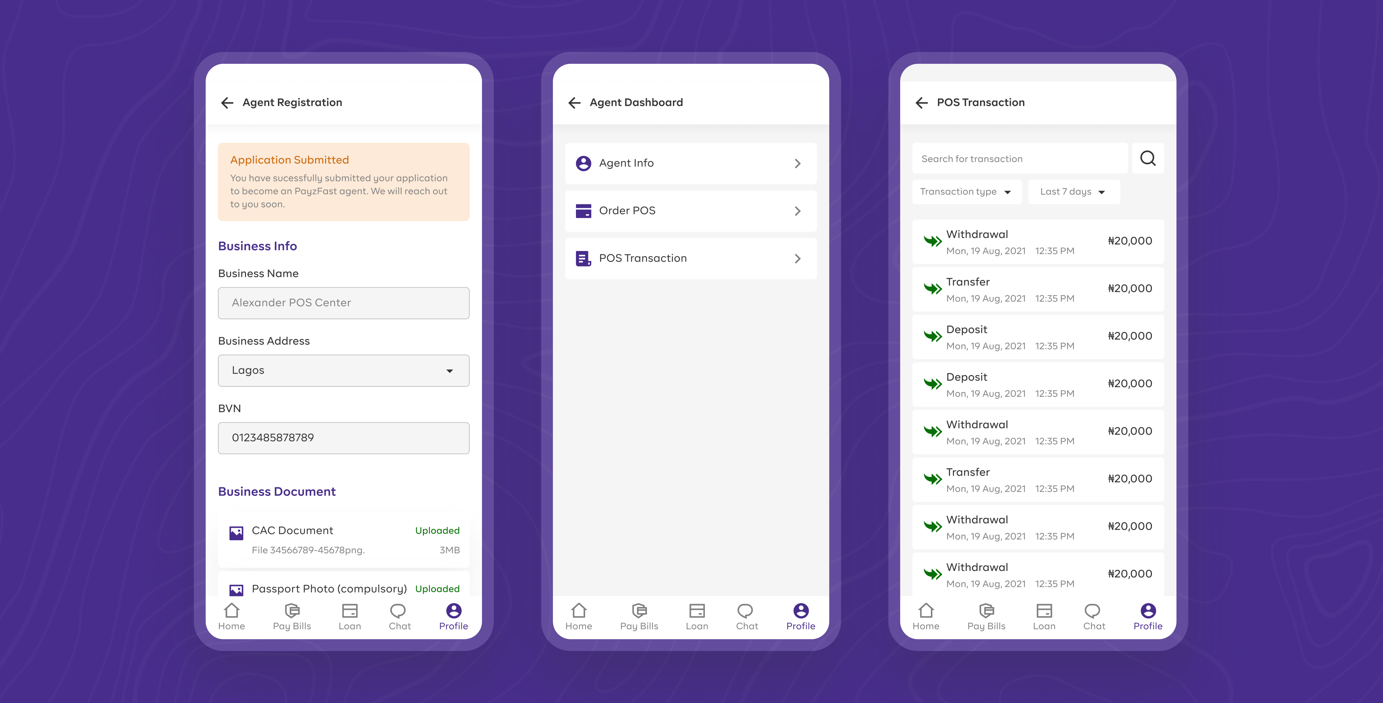
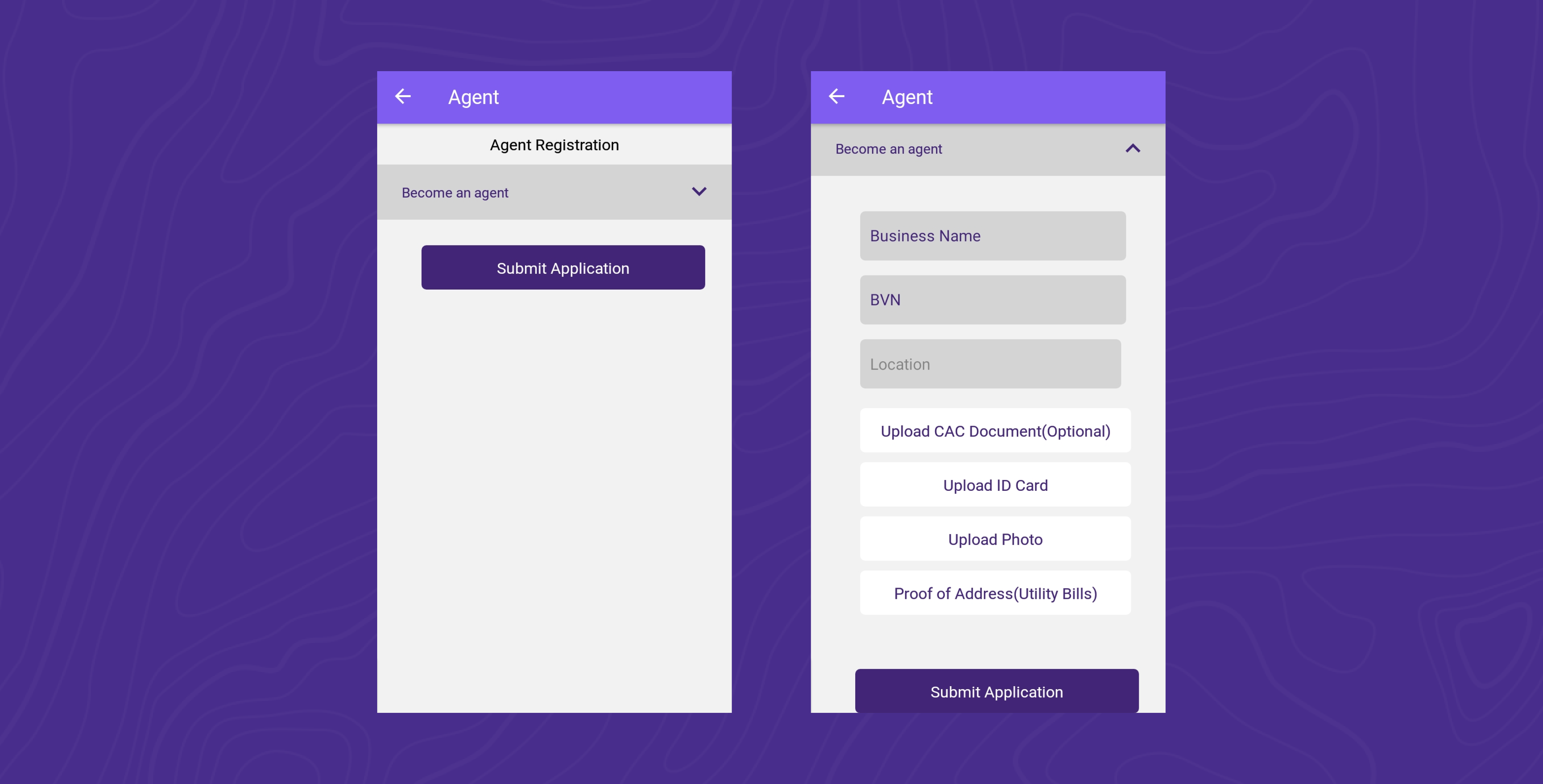
For users to be approved as payzFast agent, informations related their business and preffered POS option is collected. Agent dashboard feature was added to give user more control over their agency business and to keep track of their transactions
vii. Bill Payment
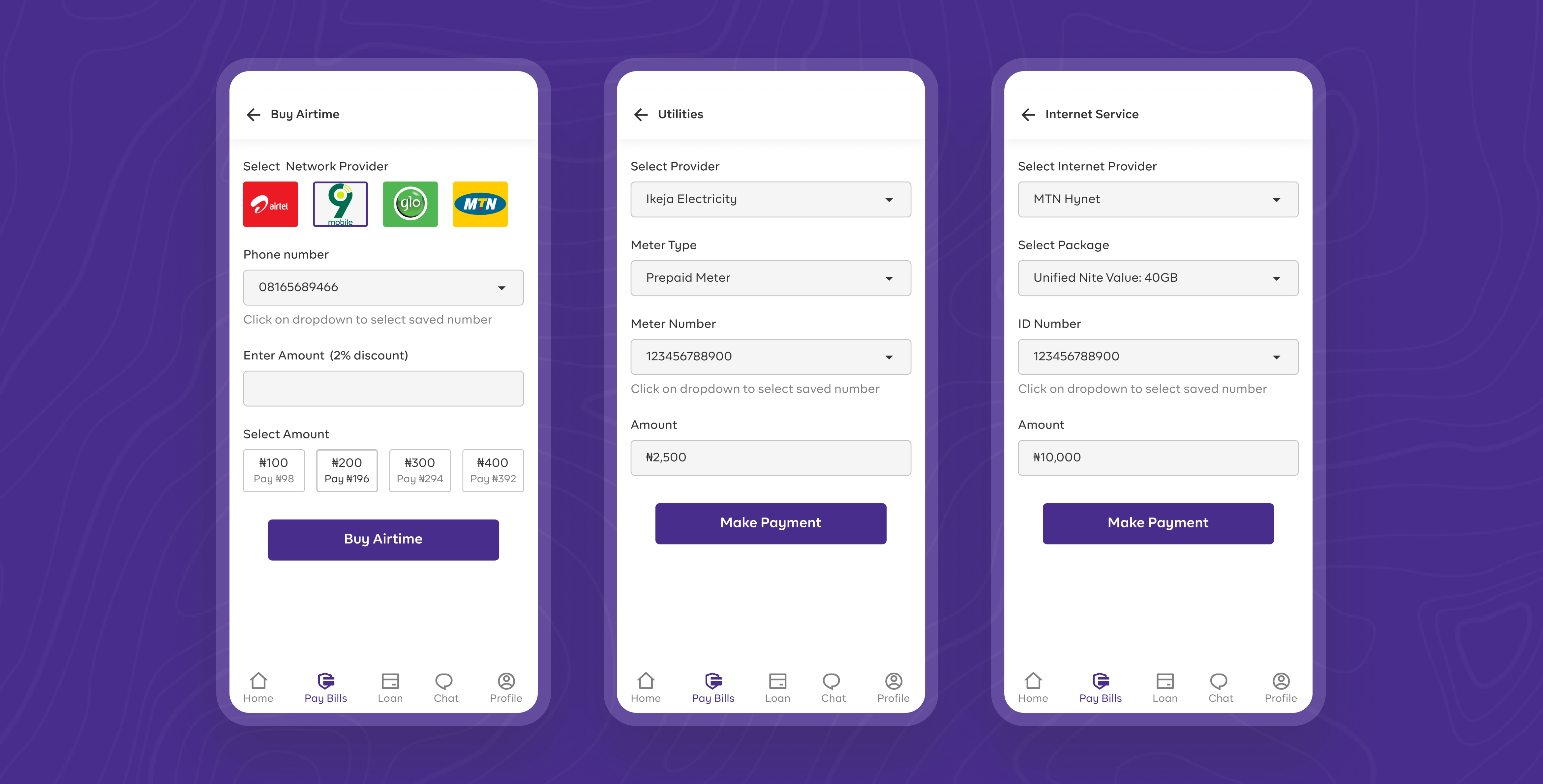
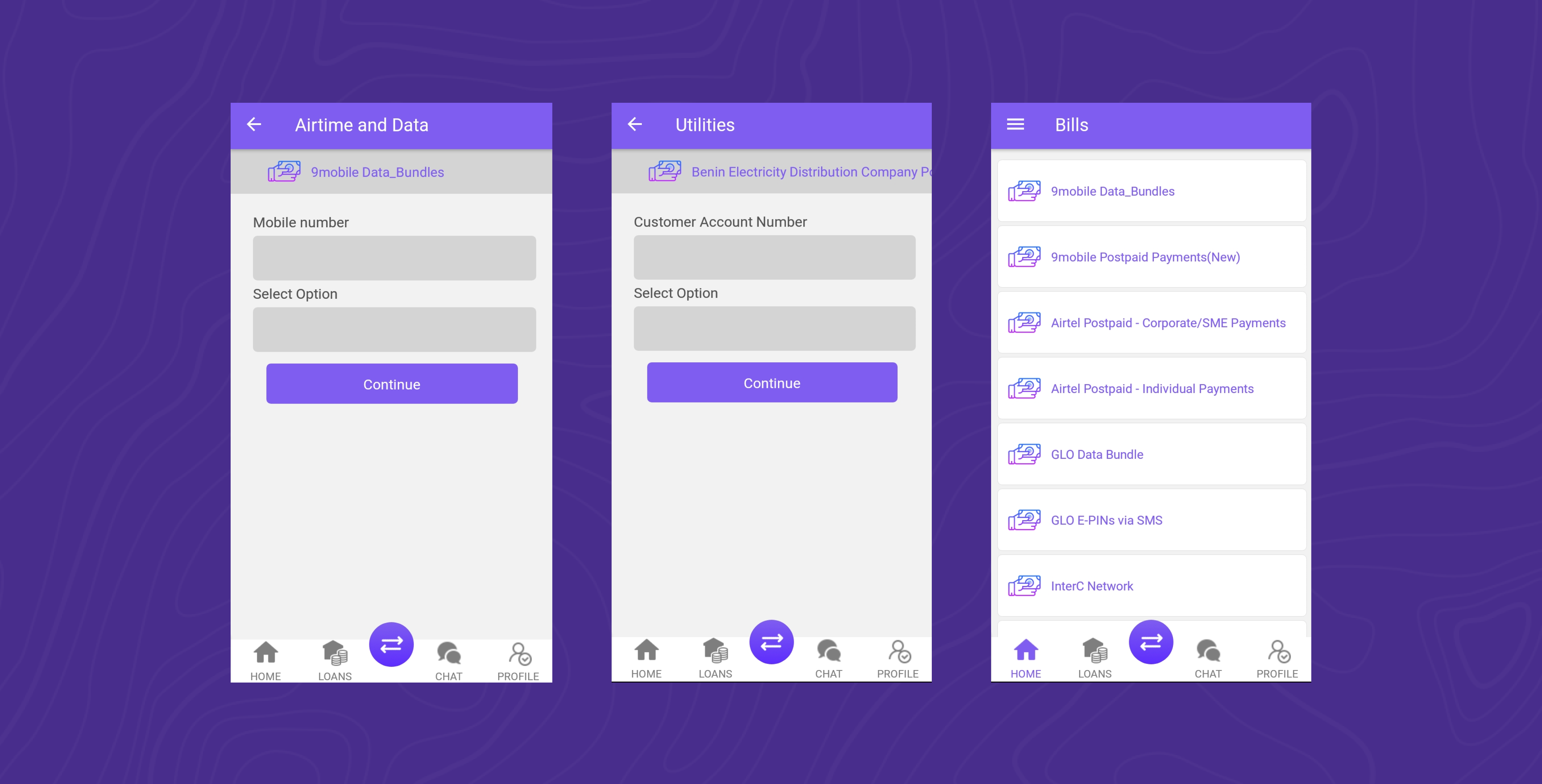
A more simplified bill payment screen is designed for easy and quick transaction. ID, meter, phone number can be saved to beneficiary list for easier and smooth transaction in their consequent transactions.
viii. Customer Support
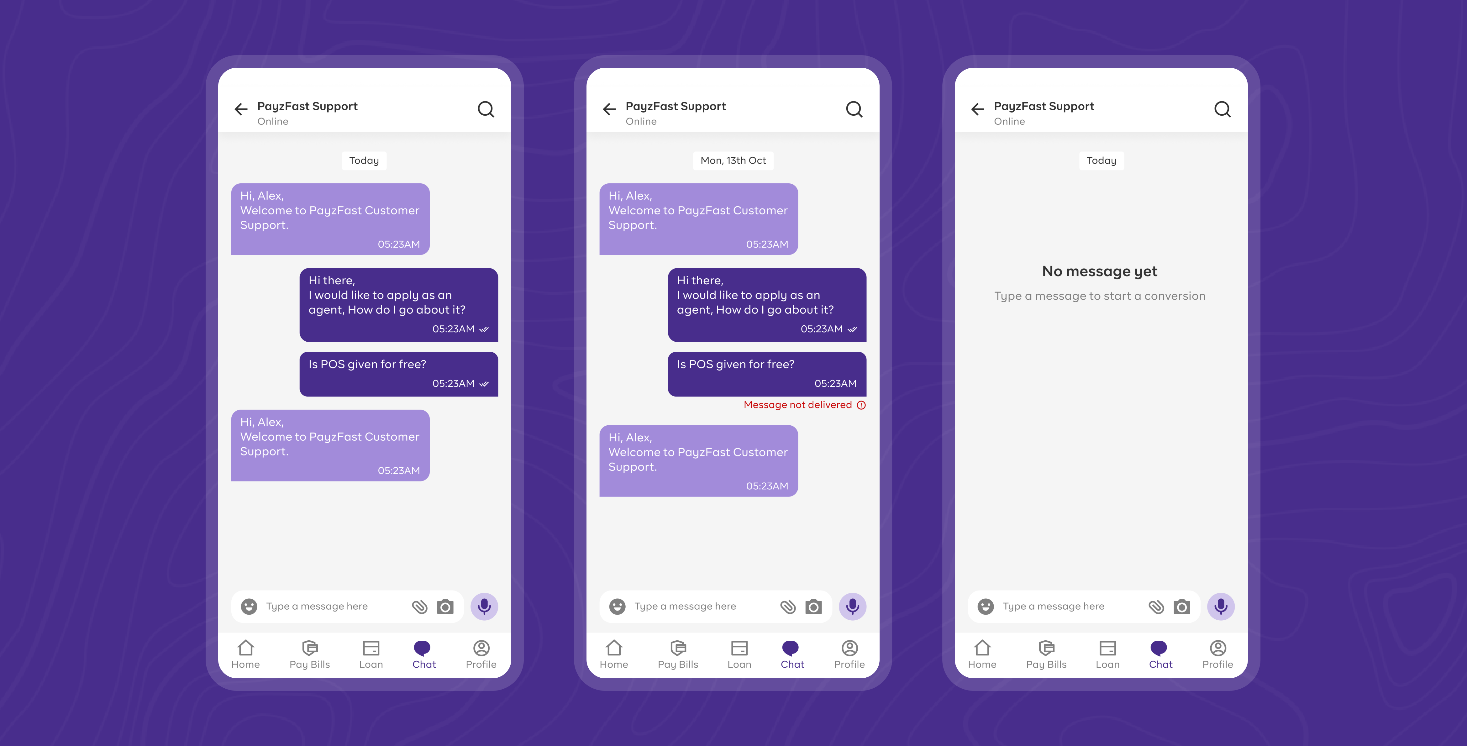
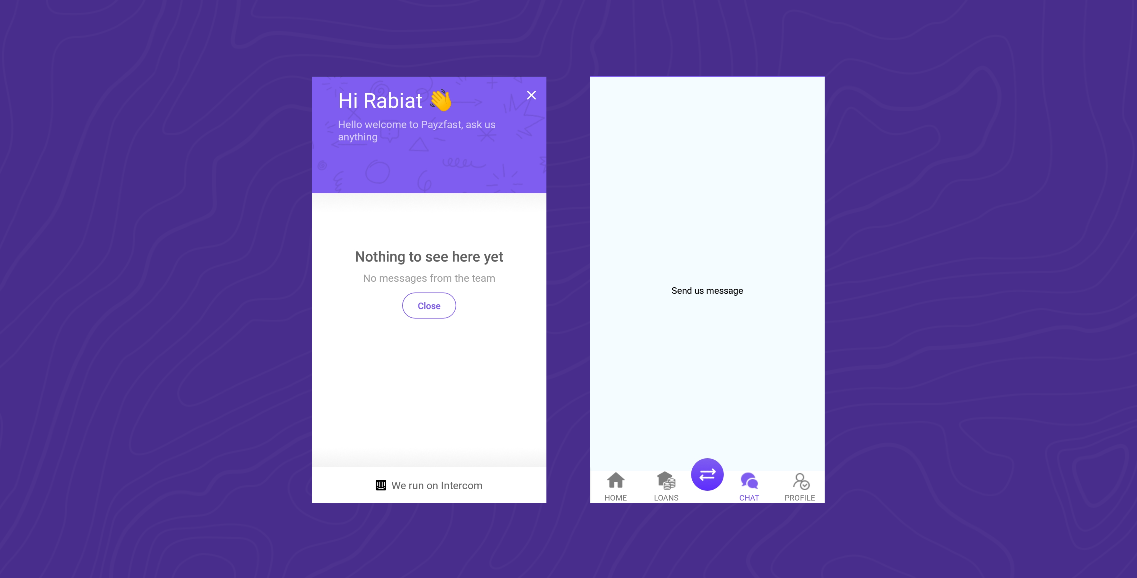
Instant and fast customer support is provided to users via the live chat feature. Users can ask for enquiry and provide feedback as well. A keyboard and voice messaging feature is added to redesign to provide accessibility to different categories of users and to improve their experience.
ix. Other Screens
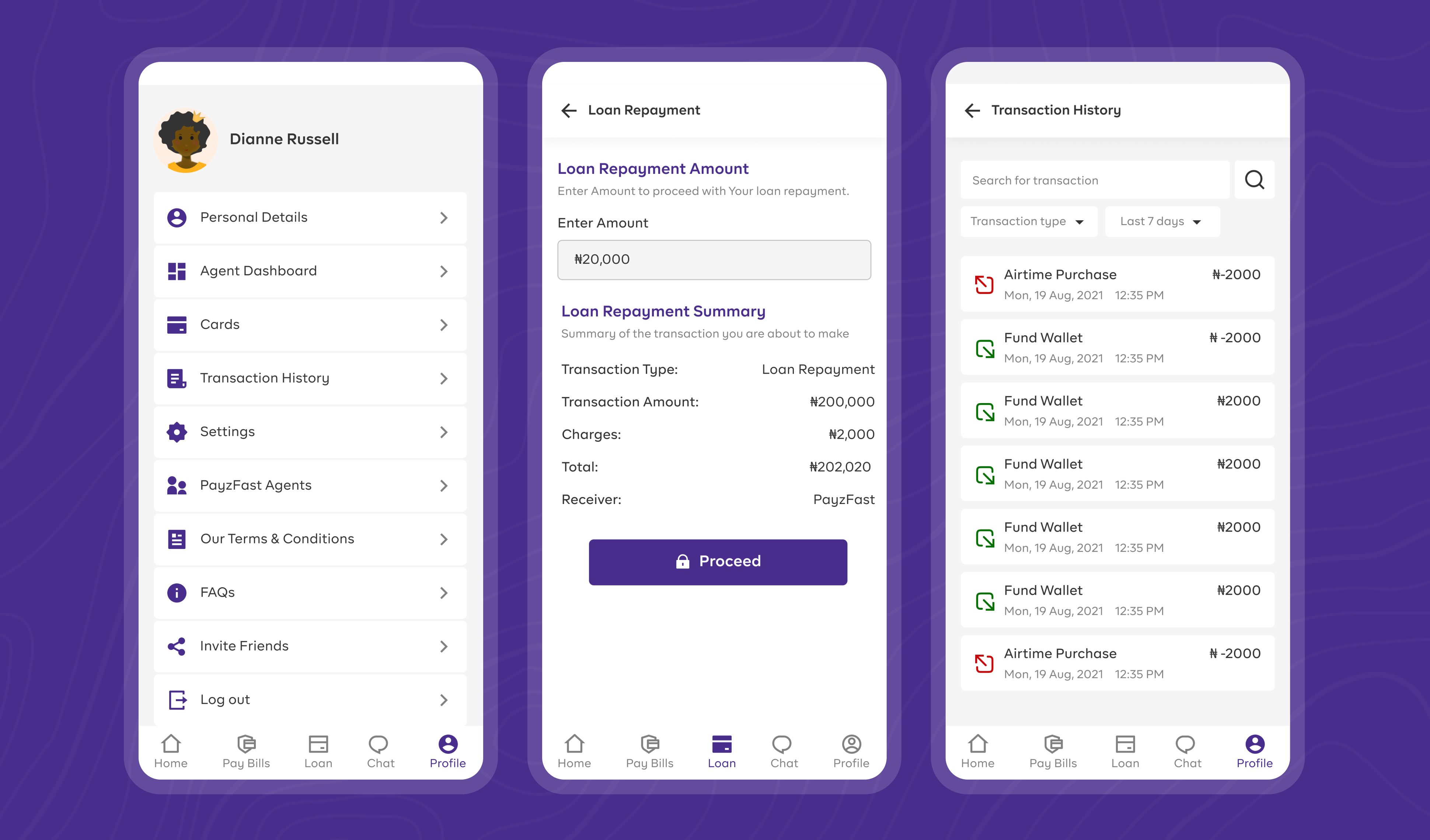
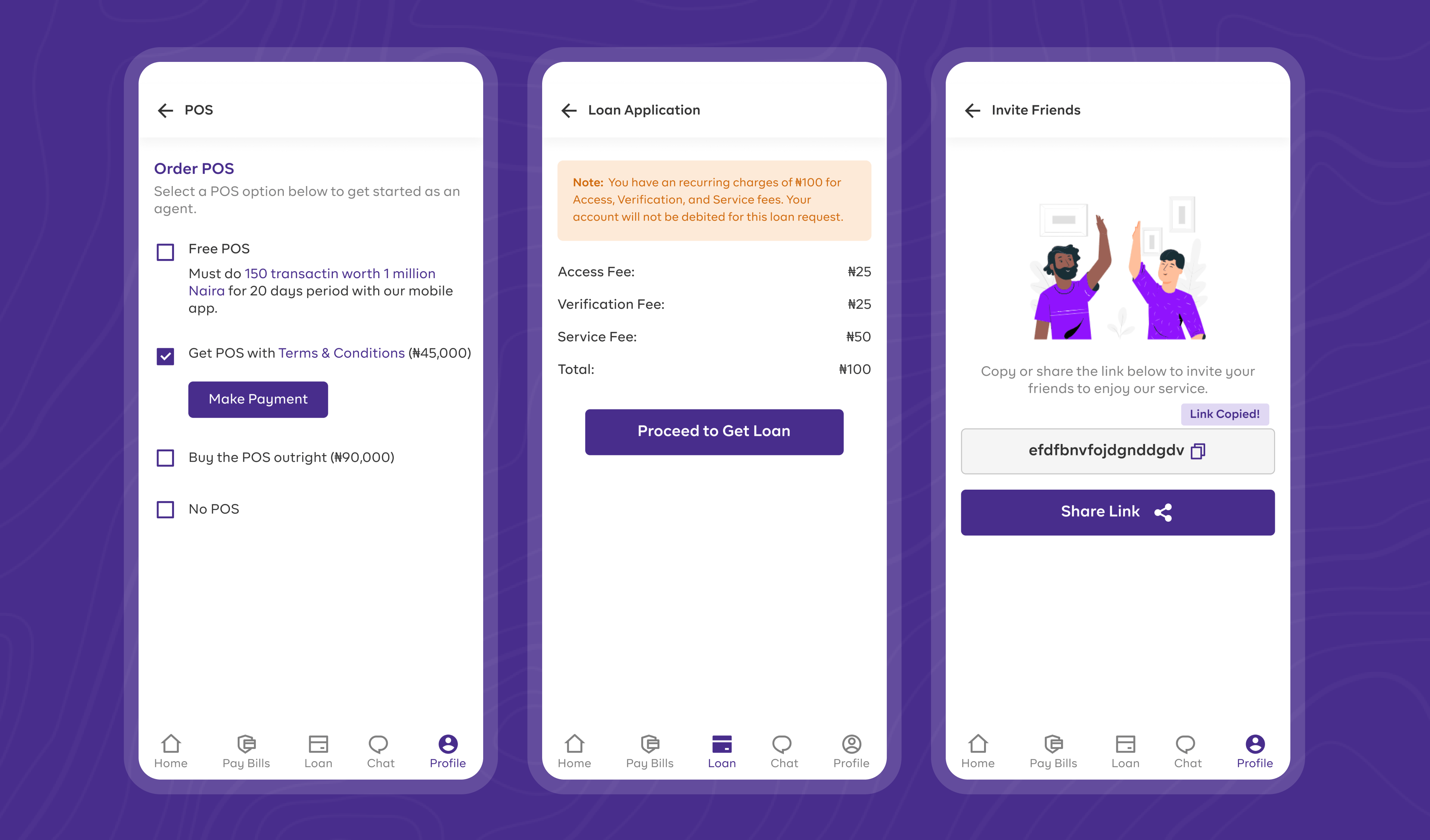
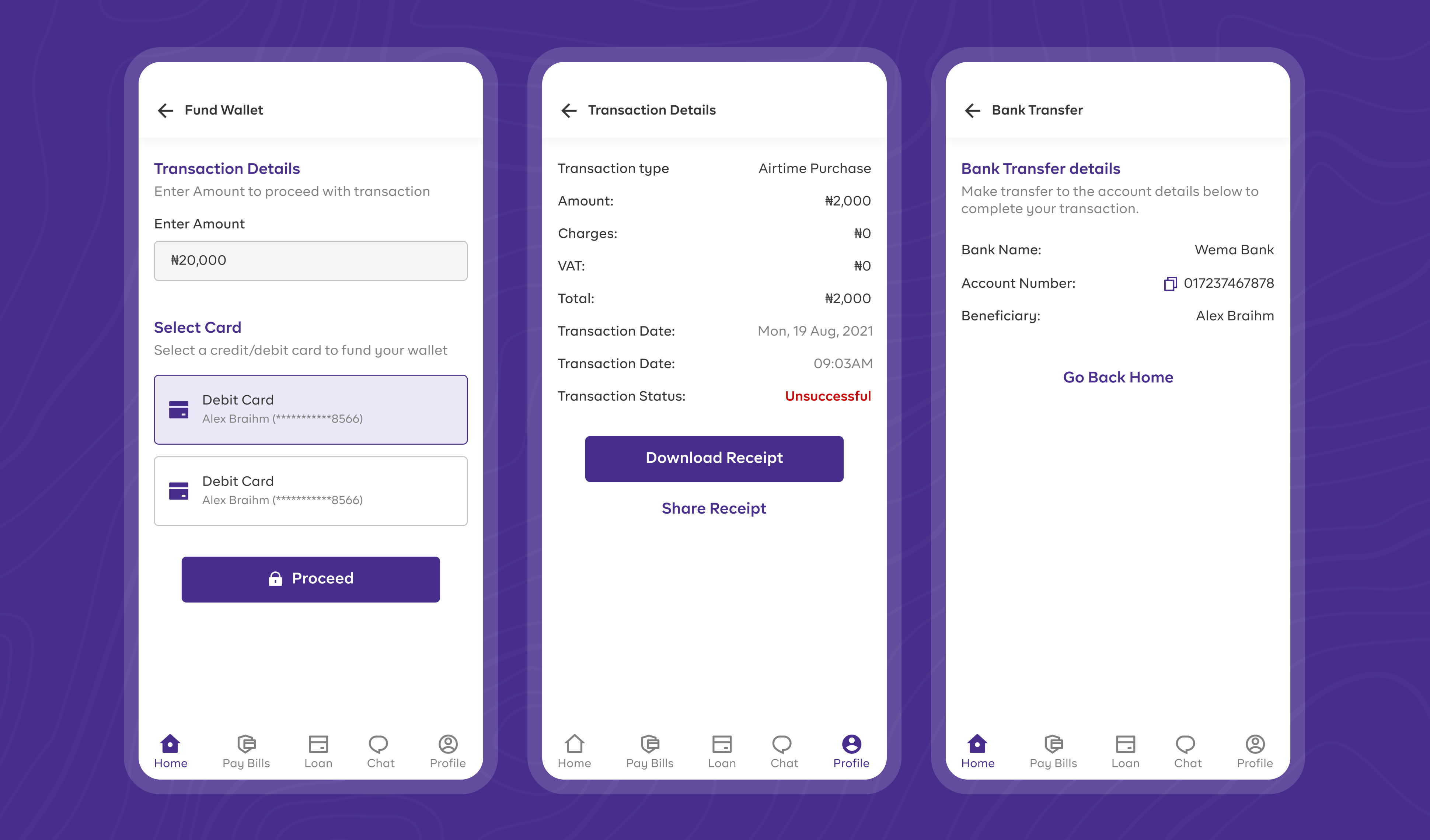
Few other screens from the redesign is presented below. Note that not all redesigned screen is presented for this case study.
